Trading 212
Making eight intimidating portfolio metrics equally readable for first-time investors - a Trading 212 design challenge I extended with my own user research.
Making eight intimidating portfolio metrics equally readable for first-time investors - a Trading 212 design challenge I extended with my own user research.
Product design
UX research
Role
Product Designer
Timeline
2 weeks
Platform
Mobile
Team
Just me
01.
"I just own a bunch of stocks."
A first-time investor told me this during an interview after the design challenge. Their portfolio was, honestly, very concentrated. Still, they weren’t concerned. They felt fine.
The real issue is the gap between feeling safe and actually being safe. Trading 212 asked us to design a "portfolio health" feature to show investors how their portfolio is doing, highlight what’s over- or under-weighted, and help them see what to fix. The challenge wasn’t the data—brokerages already have plenty. The problem was that the people who need this feature most often don’t have the knowledge or experience to use it. A list of metrics doesn’t help someone who doesn’t know what a "diversified" portfolio should look like.
01.
"I just own a bunch of stocks."
A first-time investor told me this during an interview after the design challenge. Their portfolio was, honestly, very concentrated. Still, they weren’t concerned. They felt fine.
The real issue is the gap between feeling safe and actually being safe. Trading 212 asked us to design a "portfolio health" feature to show investors how their portfolio is doing, highlight what’s over- or under-weighted, and help them see what to fix. The challenge wasn’t the data—brokerages already have plenty. The problem was that the people who need this feature most often don’t have the knowledge or experience to use it. A list of metrics doesn’t help someone who doesn’t know what a "diversified" portfolio should look like.
01.
"I just own a bunch of stocks."
A first-time investor told me this during an interview after the design challenge. Their portfolio was, honestly, very concentrated. Still, they weren’t concerned. They felt fine.
The real issue is the gap between feeling safe and actually being safe. Trading 212 asked us to design a "portfolio health" feature to show investors how their portfolio is doing, highlight what’s over- or under-weighted, and help them see what to fix. The challenge wasn’t the data—brokerages already have plenty. The problem was that the people who need this feature most often don’t have the knowledge or experience to use it. A list of metrics doesn’t help someone who doesn’t know what a "diversified" portfolio should look like.
02.
Confidence tracks comprehension
I asked fifteen investors a simple question: What actually makes you feel confident about your portfolio? Below are the results.
02.
Confidence tracks comprehension
I asked fifteen investors a simple question: What actually makes you feel confident about your portfolio? Below are the results.
02.
Confidence tracks comprehension
I asked fifteen investors a simple question: What actually makes you feel confident about your portfolio? Below are the results.

The ranking isn’t about which health metric is most important. It shows how easy each idea is to understand. The hardest-to-understand metrics are at the bottom. For example, solely advanced investors mentioned ESG. This confirmed our main idea: the problem isn’t a lack of data, it’s a lack of clarity. The usual instinct is to add more—more metrics, more detail, more precision. But adding more just makes things harder for beginners and only helps advanced users. Our goal was the opposite: make every metric, even the tough ones, easy to read for everyone. That’s why the whole design uses one clear approach across all eight features, so even the hardest concept is as simple as the easiest.

03.
Am I okay?
Before anything else, the app answers the question users want to know: Am I okay? The home screen turns each health metric into a card that gives a verdict at a glance.
I tested three ways to show that verdict: a single health score, the full breakdown, or both. The third option won, and it wasn't even close. People liked a score because it's fast, but almost no one trusted it alone, and the distrust grew with experience: not one advanced investor would take the number without the evidence behind it.
03.
Am I okay?
Before anything else, the app answers the question users want to know: Am I okay? The home screen turns each health metric into a card that gives a verdict at a glance.
I tested three ways to show that verdict: a single health score, the full breakdown, or both. The third option won, and it wasn't even close. People liked a score because it's fast, but almost no one trusted it alone, and the distrust grew with experience: not one advanced investor would take the number without the evidence behind it.
03.
Am I okay?
Before anything else, the app answers the question users want to know: Am I okay? The home screen turns each health metric into a card that gives a verdict at a glance.
I tested three ways to show that verdict: a single health score, the full breakdown, or both. The third option won, and it wasn't even close. People liked a score because it's fast, but almost no one trusted it alone, and the distrust grew with experience: not one advanced investor would take the number without the evidence behind it.
04.
Every metric reads the same way
This screen answers the main question: Am I diversified? All eight screens use the same layout—what it means, how you’re doing, the evidence, and what to do next. Once you learn the format with a familiar concept, the harder metrics become just as easy to read because they look the same.
04.
Every metric reads the same way
This screen answers the main question: Am I diversified? All eight screens use the same layout—what it means, how you’re doing, the evidence, and what to do next. Once you learn the format with a familiar concept, the harder metrics become just as easy to read because they look the same.
04.
Every metric reads the same way
This screen answers the main question: Am I diversified? All eight screens use the same layout—what it means, how you’re doing, the evidence, and what to do next. Once you learn the format with a familiar concept, the harder metrics become just as easy to read because they look the same.

Explanation: What the feature tracks, described in simple words before showing any numbers.

Verdict: The fast read: a color and one sentence. Am I okay?

Evidence: The numbers behind the verdict.

Action: What to actually do about it.
Explanation: What the feature tracks, described in simple words before showing any numbers.
Verdict: The fast read: a color and one sentence. Am I okay?
Evidence: The numbers behind the verdict.
Action: What to actually do about it.
Explanation: What the feature tracks, described in simple words before showing any numbers.
Verdict: The fast read: a color and one sentence. Am I okay?
Evidence: The numbers behind the verdict.
Action: What to actually do about it.

05.
The hardest metric looks exactly like the easiest
On the left is asset allocation: the split between stocks, bonds, and cash. Most people have a rough feel for it. On the right are ESG and thematic exposure: the metrics that my research found were understood solely by advanced investors, the ones a beginner dismisses entirely.
They're the same screen. Same gauge, same verdict, same breakdown, same depth of explanation. The concept that used to be “reserved” only for experienced investors is now built from the same parts as the one everybody already understands, so a beginner can make the connection. That's the entire thesis in a nutshell: when every metric shares a common ground, difficulty stops being a barrier to entry.
05.
The hardest metric looks exactly like the easiest
On the left is asset allocation: the split between stocks, bonds, and cash. Most people have a rough feel for it. On the right are ESG and thematic exposure: the metrics that my research found were understood solely by advanced investors, the ones a beginner dismisses entirely.
They're the same screen. Same gauge, same verdict, same breakdown, same depth of explanation. The concept that used to be “reserved” only for experienced investors is now built from the same parts as the one everybody already understands, so a beginner can make the connection. That's the entire thesis in a nutshell: when every metric shares a common ground, difficulty stops being a barrier to entry.
05.
The hardest metric looks exactly like the easiest
On the left is asset allocation: the split between stocks, bonds, and cash. Most people have a rough feel for it. On the right are ESG and thematic exposure: the metrics that my research found were understood solely by advanced investors, the ones a beginner dismisses entirely.
They're the same screen. Same gauge, same verdict, same breakdown, same depth of explanation. The concept that used to be “reserved” only for experienced investors is now built from the same parts as the one everybody already understands, so a beginner can make the connection. That's the entire thesis in a nutshell: when every metric shares a common ground, difficulty stops being a barrier to entry.
06.
Eight metrics, one system
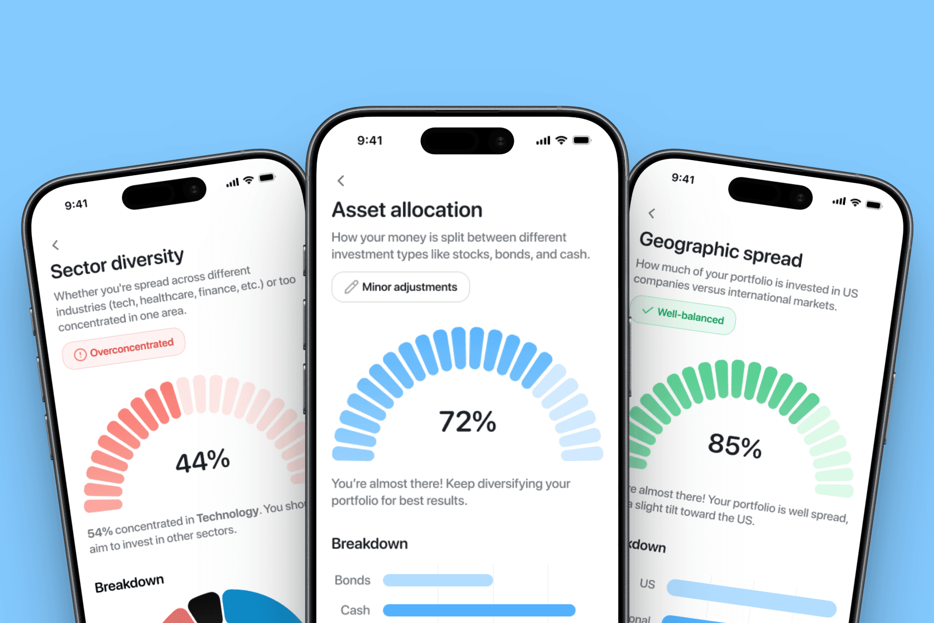
These are the remaining health checks — geographic spread, risk, investment style, cost efficiency. You already know how to read them, because they're built exactly like the two you just saw. That's the point of a shared grammar: the system scales to any metric without asking the user to learn anything new. Every screen is fully themed for light and dark, handled with design tokens so the whole set stays consistent as it grows.
06.
Eight metrics, one system
These are the remaining health checks — geographic spread, risk, investment style, cost efficiency. You already know how to read them, because they're built exactly like the two you just saw. That's the point of a shared grammar: the system scales to any metric without asking the user to learn anything new. Every screen is fully themed for light and dark, handled with design tokens so the whole set stays consistent as it grows.
06.
Eight metrics, one system
These are the remaining health checks — geographic spread, risk, investment style, cost efficiency. You already know how to read them, because they're built exactly like the two you just saw. That's the point of a shared grammar: the system scales to any metric without asking the user to learn anything new. Every screen is fully themed for light and dark, handled with design tokens so the whole set stays consistent as it grows.


07.
Users group concentration under risk. My structure didn't.
The card sort was right: users genuinely tie concentration to risk, and a structure that grouped metrics — risk, efficiency, values — with roll-up scores would match how they think. But that structure serves a particular kind of user: the advanced investor who wants to drill into exactly what's dragging a portfolio down. Trading 212 is built to make investing accessible to first-time investors, and the feature had to work for someone whose question is simply "is my portfolio healthy?" A flat set of equal, equally-readable screens answers that question better than a hierarchy does — no navigating into groups, no composite scores hiding which part is the problem.
The nested model isn't wrong; it's right for a more advanced audience than this one. What the research sharpened for me wasn't that I'd built the wrong thing — it's exactly which user each structure is for.
07.
Users group concentration under risk. My structure didn't.
The card sort was right: users genuinely tie concentration to risk, and a structure that grouped metrics — risk, efficiency, values — with roll-up scores would match how they think. But that structure serves a particular kind of user: the advanced investor who wants to drill into exactly what's dragging a portfolio down. Trading 212 is built to make investing accessible to first-time investors, and the feature had to work for someone whose question is simply "is my portfolio healthy?" A flat set of equal, equally-readable screens answers that question better than a hierarchy does — no navigating into groups, no composite scores hiding which part is the problem.
The nested model isn't wrong; it's right for a more advanced audience than this one. What the research sharpened for me wasn't that I'd built the wrong thing — it's exactly which user each structure is for.
07.
Users group concentration under risk. My structure didn't.
The card sort was right: users genuinely tie concentration to risk, and a structure that grouped metrics — risk, efficiency, values — with roll-up scores would match how they think. But that structure serves a particular kind of user: the advanced investor who wants to drill into exactly what's dragging a portfolio down. Trading 212 is built to make investing accessible to first-time investors, and the feature had to work for someone whose question is simply "is my portfolio healthy?" A flat set of equal, equally-readable screens answers that question better than a hierarchy does — no navigating into groups, no composite scores hiding which part is the problem.
The nested model isn't wrong; it's right for a more advanced audience than this one. What the research sharpened for me wasn't that I'd built the wrong thing — it's exactly which user each structure is for.

08.
The app tells you what to fix. Not what to fix first.
I gave fifteen people three tasks. Two went well: they could find what was dragging their portfolio down, and they could tell whether they were overexposed to a sector — quickly and confidently. The third asked them to find the single change that would most improve their portfolio health, and there success dropped to under half. They could see every problem the app surfaced. They just couldn't tell which one to act on first.
The screens do offer direction. Each metric ends with suggestions — trim this position, spread that weight, consider more bonds. But those suggestions live per screen, in isolation. A beginner with red flags across concentration, sector, and cost is left holding five reasonable suggestions and no sense of which one matters most this week. The app advises. It doesn't prioritise.
The next version isn't more metrics — it's a layer above them: of everything flagged, the one move to make next.
08.
The app tells you what to fix. Not what to fix first.
I gave fifteen people three tasks. Two went well: they could find what was dragging their portfolio down, and they could tell whether they were overexposed to a sector — quickly and confidently. The third asked them to find the single change that would most improve their portfolio health, and there success dropped to under half. They could see every problem the app surfaced. They just couldn't tell which one to act on first.
The screens do offer direction. Each metric ends with suggestions — trim this position, spread that weight, consider more bonds. But those suggestions live per screen, in isolation. A beginner with red flags across concentration, sector, and cost is left holding five reasonable suggestions and no sense of which one matters most this week. The app advises. It doesn't prioritise.
The next version isn't more metrics — it's a layer above them: of everything flagged, the one move to make next.
08.
The app tells you what to fix. Not what to fix first.
I gave fifteen people three tasks. Two went well: they could find what was dragging their portfolio down, and they could tell whether they were overexposed to a sector — quickly and confidently. The third asked them to find the single change that would most improve their portfolio health, and there success dropped to under half. They could see every problem the app surfaced. They just couldn't tell which one to act on first.
The screens do offer direction. Each metric ends with suggestions — trim this position, spread that weight, consider more bonds. But those suggestions live per screen, in isolation. A beginner with red flags across concentration, sector, and cost is left holding five reasonable suggestions and no sense of which one matters most this week. The app advises. It doesn't prioritise.
The next version isn't more metrics — it's a layer above them: of everything flagged, the one move to make next.